
Positioning
Family-run, fully accredited, since 1990
Paynes Heating & Plumbing is a family-run, fully accredited heating, plumbing and renewable energy contractor that has served homes, businesses and public bodies across Sussex and Kent since 1990. Paynes installs and maintains boilers, central heating, heat pumps, tepeo heat batteries, solar PV and battery storage, and answers emergencies 24 hours a day.
Proof points
35 years trading. Gas Safe, OFTEC, MCS, NICEIC, RECC, APHC and TrustMark. Own engineers, fleet and premises. Established tepeo ZEB installer. 260 Google reviews at 4.2 out of 5.
Proposed tagline (needs approval)
Heating and renewable energy specialists since 1990.
The current H1 plus the founding year.
| Audience | What they need to hear | Tone |
|---|---|---|
| Homeowners in Sussex and Kent | Fast response, qualified engineers, clear prices, tidy work, local. | Warm but factual; lead with the outcome. |
| Commercial, facilities, public sector | Accreditations, insurance, compliance, track record, capacity. | Most formal; cite standards and numbers. |
| Landlords and property managers | Certificates, servicing contracts, emergency cover. | Practical and procedural. |
| Builders and estate agents | Reliability on site, referral terms, coverage. | Peer to peer; brief. |
Logo
The wordmark
One mark, three backgrounds. The vector master is paynes-logo.svg (white paths on a transparent 335×78 canvas, owner-sourced 2026-09-05); the fill and the background are set by the container, never by editing the file.
Sizes
The mark scales without change from 96 px to full width. Below 96 px on screen (25 mm in print) use the P icon instead.
Clear space
Keep a margin equal to the height of the P on every side. Nothing else enters that zone: no text, no icons, no photo edges.
Never
The mark is fixed. These are the ways it goes wrong.
Logo · the second mark
The spanner
The counter of the E in the wordmark is an open-end spanner: a round head, a V-notch jaw and a handle. Redrawn as a standalone device (2026-09-06), it is the brand's second mark. The wordmark says who; the spanner says what. It carries the trade across the website without photography, and it is the one shape allowed to be decorative.
Single-ended
paynes-spanner.svg · 100×40. The large device: a hero anchor cropped by the page edge or held inside the page column. Rotates in 45° steps.
Double-ended
paynes-spanner-double.svg · 160×40. Rules, dividers, repeating strips. Lengthen the handle only; the heads never change.
Head
paynes-spanner-head.svg · 50×40. List marker, link arrow (it points the way the jaw opens), eyebrow accent. 16 to 24 px; below 16 px use a red dot. Test (2026-09-06): the handle stub ends in a 45° point that mirrors the jaw, instead of a square cut. Master file and site still carry the square end until this is approved.
Proportions
Taken from the E and fixed at every size, on a 40-unit height: head diameter 32, jaw opening 14.8, apex 7.3 in from the jaw mouth, handle 12 thick. The head is a true circle and the jaw sides sit at 45°.
Path (100×40): M5.82 12.6 L17.3 12.6 L24.6 20 L17.3 27.4 L5.82 27.4 A16 16 0 0 0 34.83 26 L100 26 L100 14 L34.83 14 A16 16 0 0 0 5.82 12.6 Z. For a longer handle move the two L100 points; for the double, mirror the head at the far end.
Construction
Everything in the mark comes from one circle and two 45° lines. The head is a circle of radius 16 on a 40-unit height; the handle's edges are tangent to a circle of radius 6 around the same centre; the jaw is a right angle whose sides run at 45°, with its apex 4.6 units to the right of the centre. The same construction sits inside the E of the wordmark, where the E's middle arm is the prong the jaw grips.
Fig. 1. The counter of the E is the spanner head; the E's middle arm is the prong the jaw closes on, and the gap in the E's right side is the handle leaving the head.
Fig. 2. Head circle r 16 centred at (20, 20); the canvas height is r 20 from the same centre; handle edges tangent to r 6; jaw sides at 45° meeting at (24.6, 20); handle meets the head at x 34.83.
The spanner was never drawn as a separate mark: it was found in the counter of the E when the wordmark was vectorised in 2026 and lifted out at the same proportions. Because the E, the head circle and the 45° jaw share one construction, the device and the wordmark always agree, whatever the size.
Colours
In use
In a hero
Left: the head sits inside the page column, vertically centred, and the handle leaves at 45° through the bottom of the section. The small head is the eyebrow accent; the red bar under the title is the only other red.
As a rule
Double-ended, full column width, ink. Heads stay 32 units; only the handle stretches.
As a marker
- No flame, no flue, no outdoor unit
- Runs your existing radiators
See heating
Sparingly: a short list, a link arrow, an eyebrow. In dense lists use a red + instead.
Rules
- One large spanner per page, behind or beside content, never across text that has to be read.
- Crop deliberately: off a page edge, or stopped inside the page column. Never half-hidden behind a paragraph.
- Orientation in 45° steps. The handle leaves the head on the side away from the jaw.
- Heads never distort. Need it longer? Extend the handle.
- Minimum head 16 px on screen, 5 mm in print; below that, a red dot.
- Not a location pin: the P icon marks places.
Never
Colour
Red, white and black
Nothing else at rest, nothing competing. The black is lifted one step from solid so long text is not oppressive; its tints do the quiet work. Red stays under 10% of any screen.
Ink tints
Links and hover
Ink text with a 2 px red underline, red on hover: boiler installation in Brighton. Every interactive element moves toward red on hover or press, over a 150 ms transition; nothing is coloured at rest. Filled red elements darken instead, so their white text stays readable.
Category badges: grey at rest, red on hover or press
Hover a badge.
Dark surface (footer, tepeo section)
Typography
Montserrat, one family, four weights
Self-hosted variable woff2, font-display: swap, fallback "Segoe UI", Arial, sans-serif. Weights 400, 500, 600, 700. Body never below 16 px. Measure 60–75 characters.
Components
Buttons, badges, bars, strips
Buttons (48 px, pill, 18 px bold, 150 ms transition)
Call 01825 891720Request a quote
Primary: brand red fill, white 18 px bold, darkens 10% on hover (hover:brightness-90), text stays white. Secondary: white fill, ink text and border, red text and border on hover. All colour changes transition over 150 ms. Focus ring red, 3 px, 2 px offset. Primary is reserved for the call action (owner, 2026-09-06): every "Call" button is primary, plus the header's "Get a quote"; everything else is secondary, or white-on-dark on dark surfaces, and on a red surface the call button is white-on-dark.
Category badge + heading
Solar panel installation
Heading stays ink. The badge is grey at rest and red on hover or press.
Card
Implementation standard: Tailwind CSS
Tailwind is the styling standard for the rebuild. This page loads it from the CDN with the brand theme below; stage 04 puts the same extend block in tailwind.config.js. The component classes above are the reference implementation.
theme.extend = {
  colors: { brand: { red: '#ff402d' }, ink: { 900: '#252525', 800: '#3a3a3a', 600: '#68696b', 200: '#ececec', 50: '#fafafa' } },
  fontFamily: { sans: ['Montserrat', 'Segoe UI', 'Arial', 'sans-serif'] },
  borderRadius: { pill: '999px', card: '12px' },
  boxShadow: { card: '0 4px 16px rgba(0,0,0,0.10)' },
  transitionDuration: { DEFAULT: '150ms' }
}

// primary button
inline-flex items-center justify-center h-12 px-7 rounded-pill bg-brand-red text-white text-lg font-bold tracking-wide no-underline transition hover:brightness-90 focus-visible:outline focus-visible:outline-[3px] focus-visible:outline-offset-2 focus-visible:outline-brand-red
// secondary button
inline-flex items-center justify-center h-12 px-7 rounded-pill bg-white text-ink-900 border-2 border-solid border-ink-900 text-lg font-bold tracking-wide no-underline transition-colors hover:text-brand-red hover:border-brand-red focus-visible:outline focus-visible:outline-[3px] focus-visible:outline-offset-2 focus-visible:outline-brand-red
// link
text-ink-900 underline decoration-brand-red decoration-2 underline-offset-4 transition-colors hover:text-brand-red
// category badge
w-14 h-14 rounded-full inline-flex items-center justify-center mr-3 align-middle bg-ink-600 transition-colors hover:bg-brand-red active:bg-brand-red
Offline note: the components on this page need the Tailwind CDN to render; the rest of the page is plain CSS.
Accreditation strip (greyscale, colour on hover)





Registration numbers go beneath each logo once known. Fresh originals from each body replace these widget copies in stage 04.
Partner: tepeo ZEB

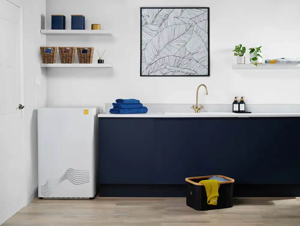
Established tepeo ZEB installer. Feature the logo and product photo together, at supplied size.
Imagery
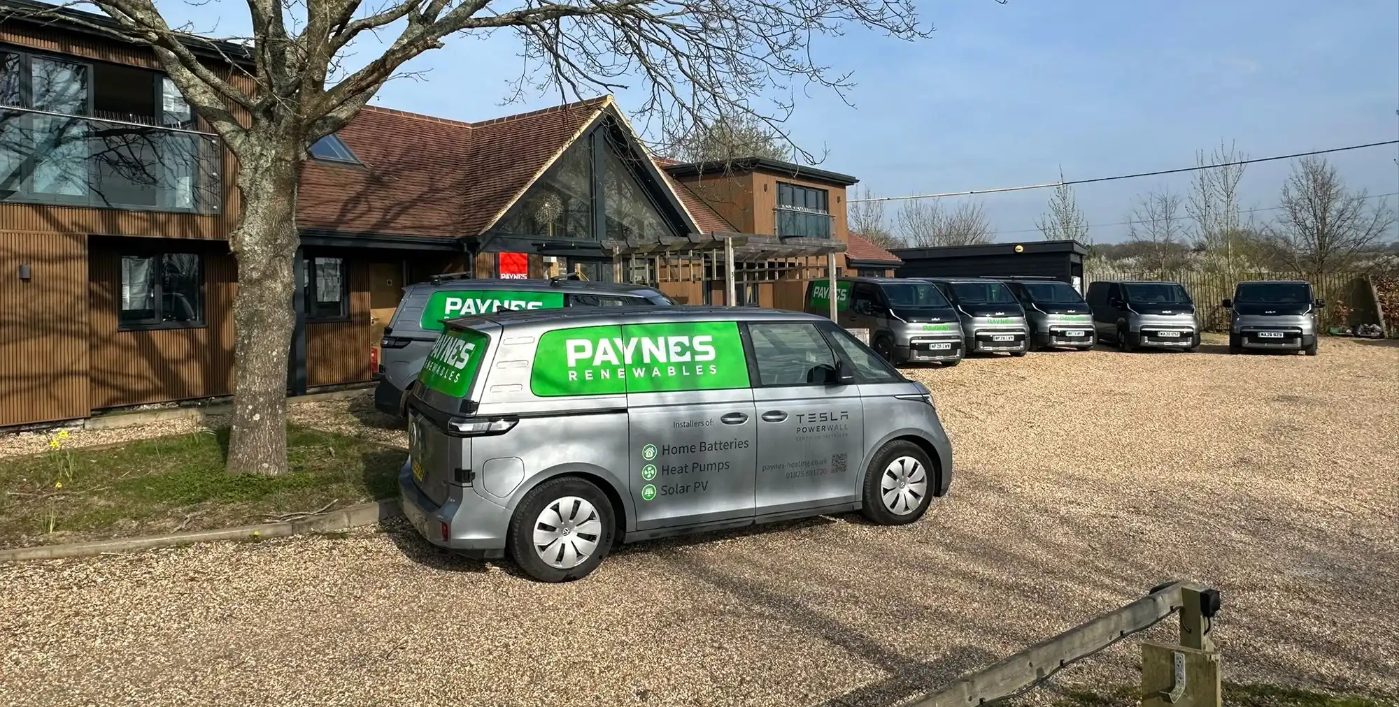
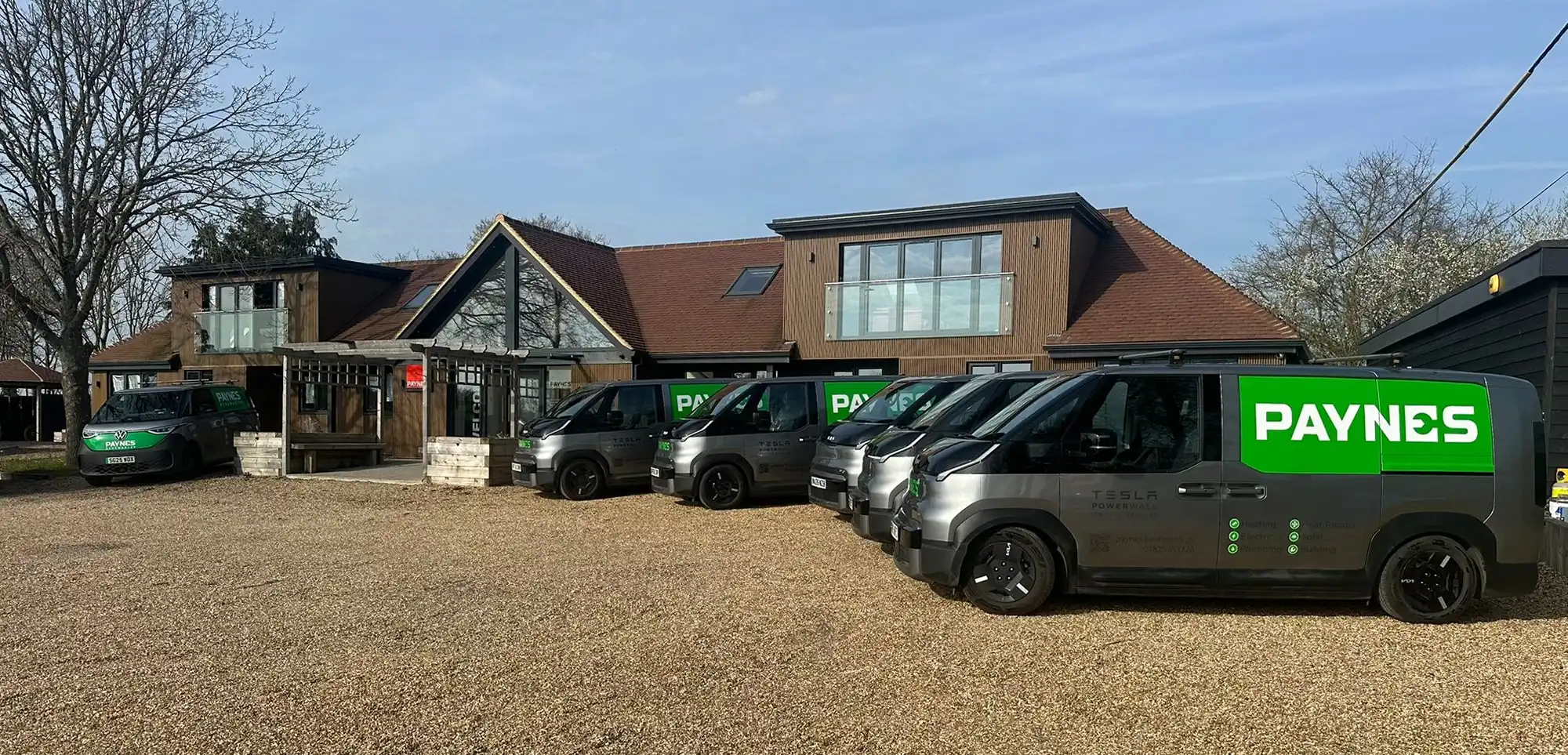
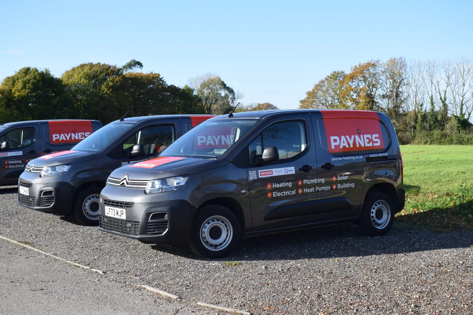
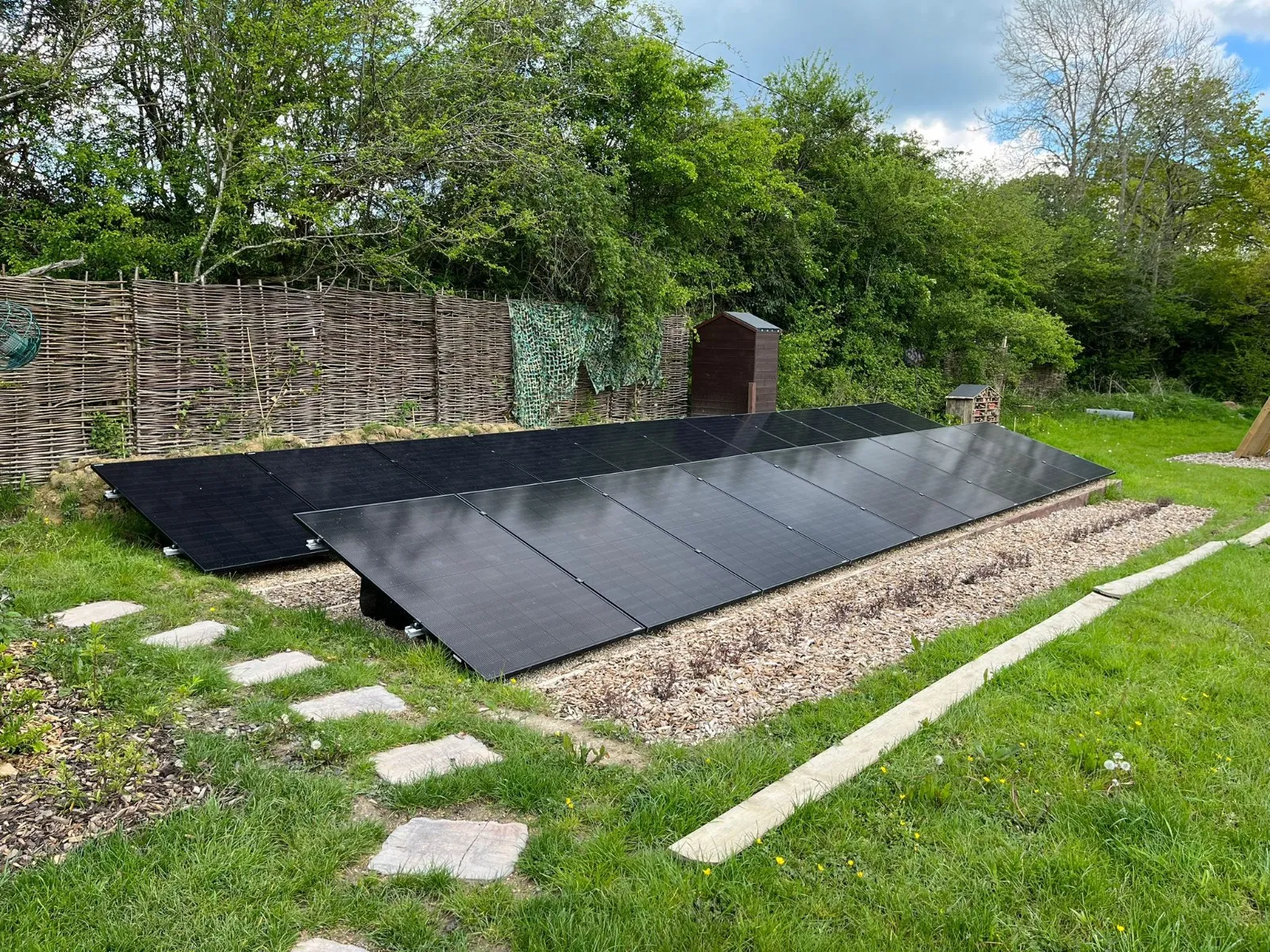
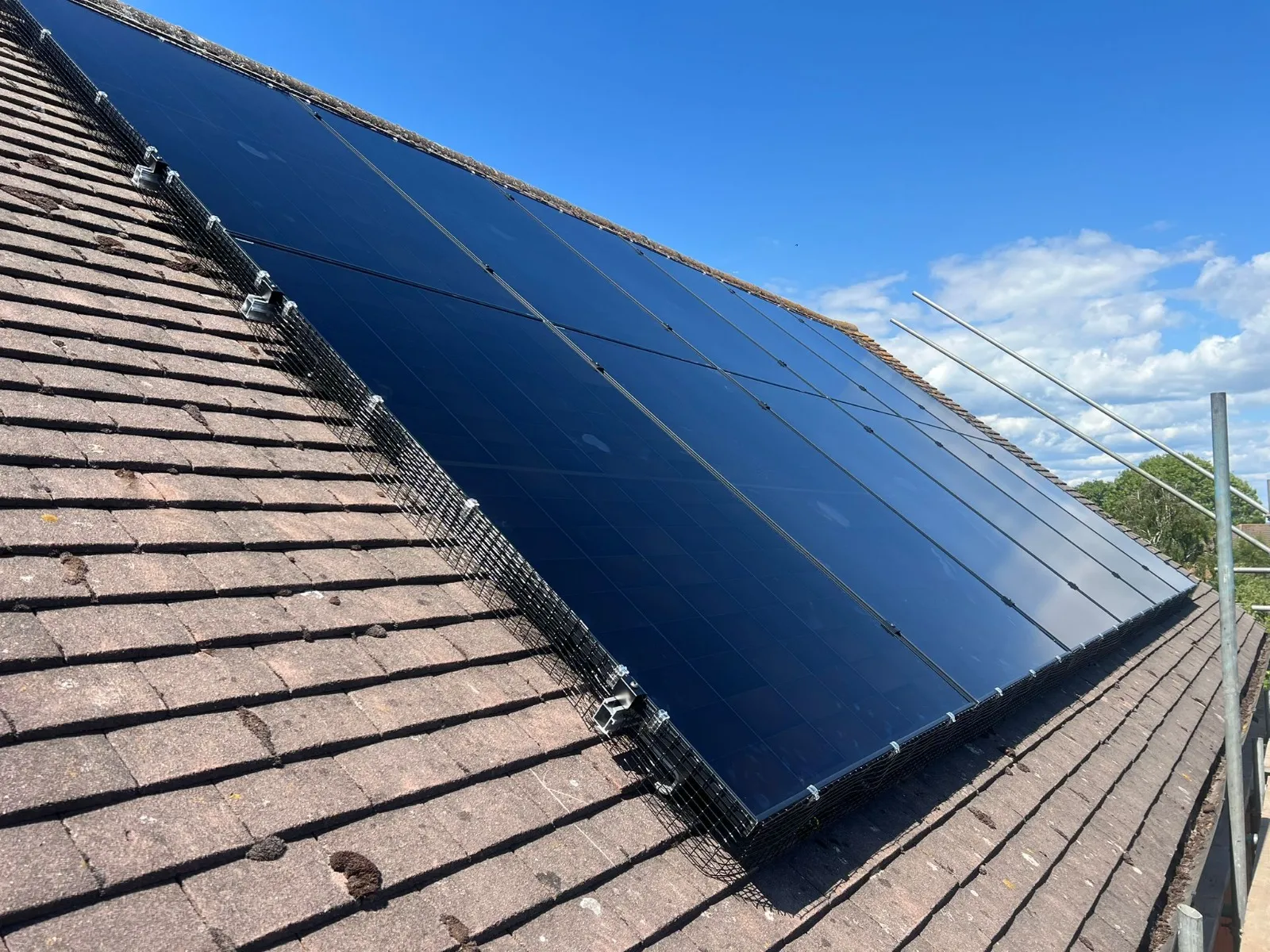
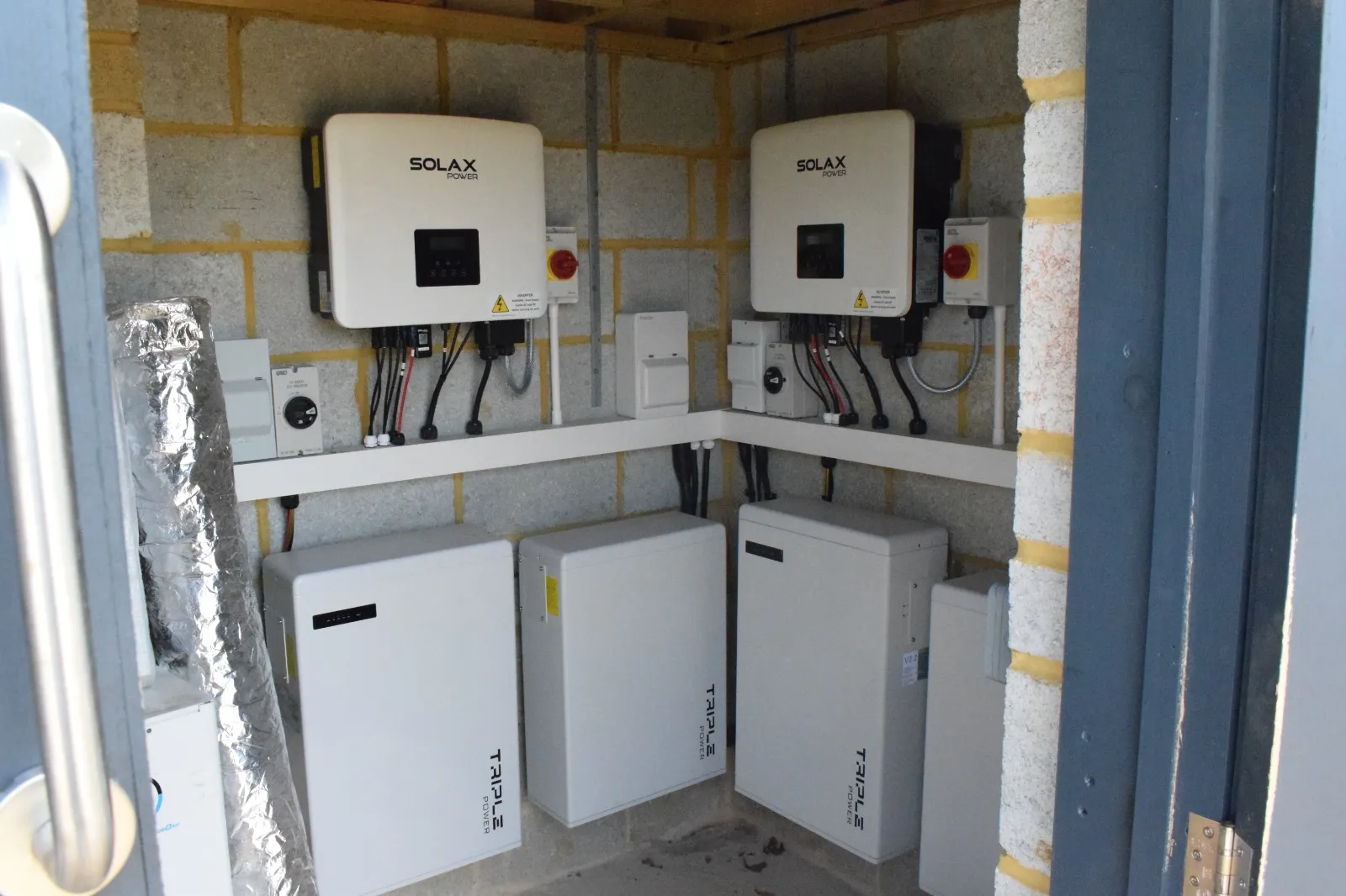
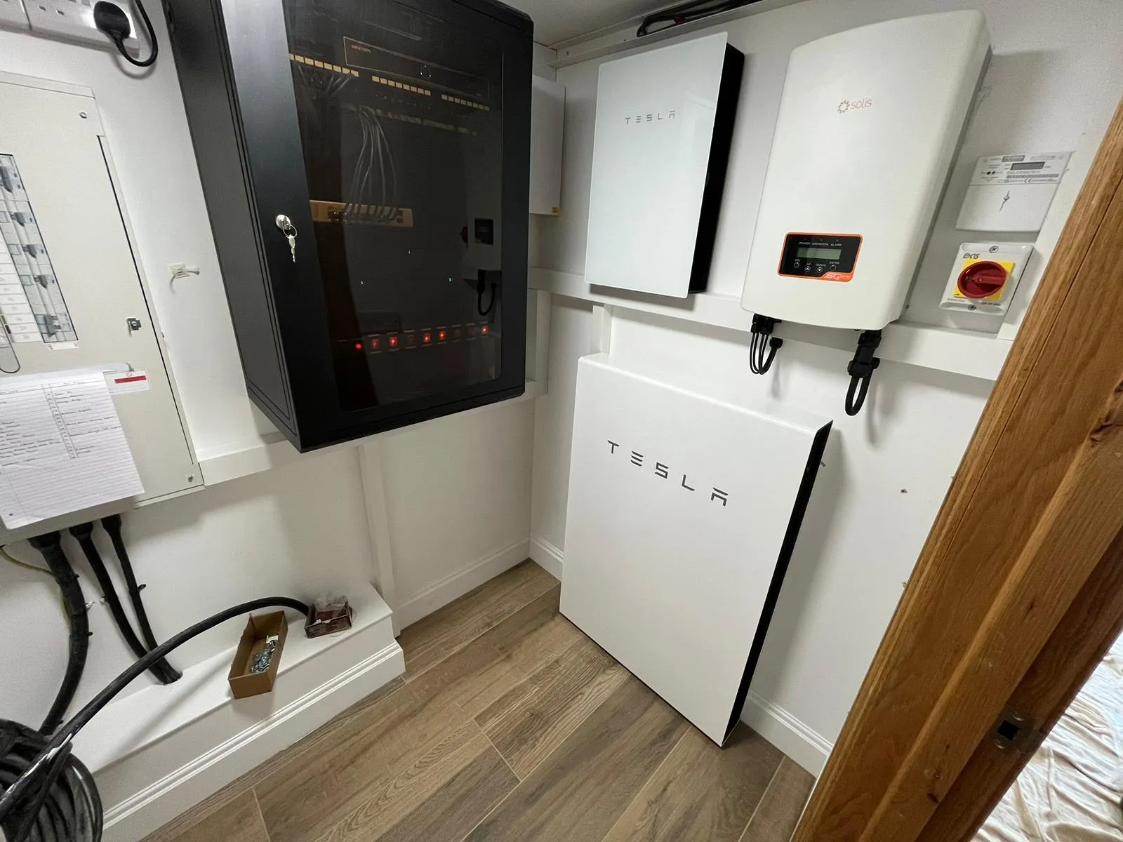
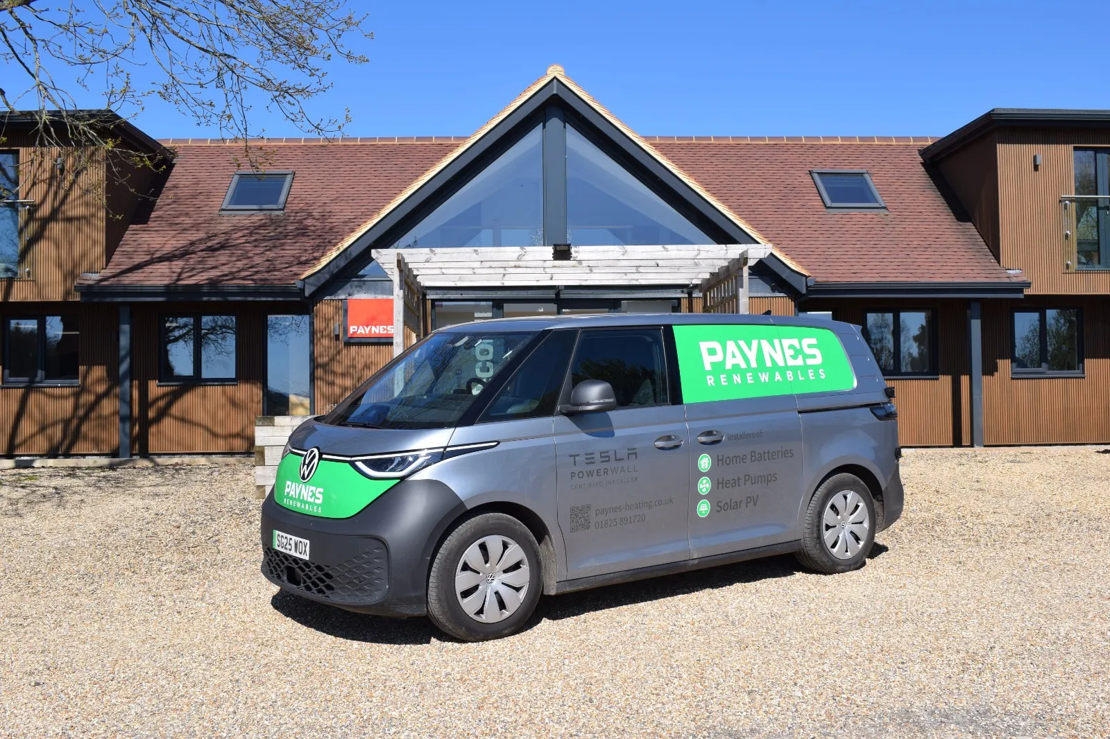
Real jobs, real vans, real kit
Every photo is a Paynes van, engineer, premises or installation in daylight, finished and tidy. No stock, no renders, no filters. Text over photos only with the 40% ink overlay. Hero 2:1 desktop, 4:5 mobile; cards 3:2.
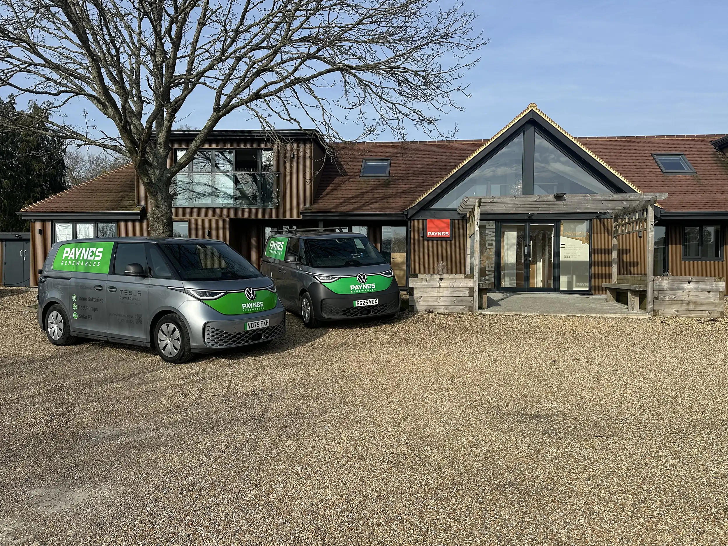
Heating and renewable energy specialists since 1990
Get a quoteHero pool (the only files at 1600–2500 px)
Rules
Do and don't
Do
- Lead every page with one fact that proves experience.
- Phone number in header, footer and mobile call bar, always 01825 891720.
- One red, #ff402d, for the logo block, buttons, underlines and icons. Text is ink.
- Montserrat only, at the scale above.
- Accreditation strip on every service page.
- Renewables gets its own photography; the green vans are a photograph, not a colour rule.
- Alt text and headings as full sentences an agent could read aloud.
Don't
- Red body or resting link text; green, yellow or blue anywhere.
- Headings coloured by service.
- Stock photography, animated counters, "site visits" statistics.
- Em-dashes, "quietly", "silently", "not this, but that".
- Stretched, recoloured or shadowed wordmark; the old JPEG favicon.
- Fonts from Google, Adobe or a PHP endpoint.
- A second red, a third font, a gradient, solid black, or any colour beyond red, white and the ink tints.
Summary
Keep the core, fix the execution
Paynes already has a recognisable identity: a bold white wordmark on signal red, real photographs of its own vans, premises and installations, and a Montserrat-led typographic voice. These guidelines keep that core and fix what the audit and asset review found: a red used for small text where it fails contrast, three font families plus two licensed icon fonts, 80 CSS colours where three would do, stock imagery, and no vector logo.
| Element | Decision | Why |
|---|---|---|
| Wordmark white on red | Keep; vector master in hand | On every van, the sign and the favicon. |
Brand red #ff402d | Keep as the only red | Fills, buttons, underlines, icons, large text. 3.5:1 on white: AA for large text and UI, never small text. |
Hover red #c0131e, tint #ffdede | Drop | A hover state and a Webflow default, not brand colours. |
| Category blue / green / yellow | Drop | Red, white and black only; hover states use red. |
| Near-black #252525 and its tints | Keep | A step up from solid black; tints for secondary text, lines, surfaces. |
| Webflow leftovers, duplicate reds | Drop | No brand meaning. |
| Montserrat | Keep, the only typeface | 90% of rendered text today; one variable file. |
| Inter, Open Sans, Typekit, Font Awesome Pro | Drop | Render blocking and licence cost for no benefit. |
| Genuine photography | Keep and lead with it | Competitors cannot copy it. |
| Twelve stock photos | Drop | Generic, licence unknown. |
| tepeo ZEB logo and photo | Keep, feature | Owner confirmed; installer status is a selling point. |
| Green "Paynes Renewables" livery | Fleet only | Would compete with red on the website; owner to confirm. |
Voice and tone
Professional. Reliable. Experienced.
Formality 4 of 5. British English, plain words, concrete facts. Short sentences, active voice, first person plural. Lead with the customer's outcome, then the proof. Numbers and names build trust. Never "quietly", "silently", "payroll", the "not this, but that" construction, or em-dashes. For the in-house point say "our own engineers, plumbers and electricians. Nothing is subcontracted." No exclamation marks in body copy.
In voice
Paynes has installed and maintained heating systems across Sussex and Kent since 1990. Every engineer is Gas Safe registered, and every job is signed off to current regulations.
A tepeo ZEB heat battery replaces your gas boiler without changing your radiators. As an established tepeo installer, we handle the survey, the installation and the commissioning.
If a pipe bursts at 2 a.m., call 01825 891720. Our emergency engineers cover Uckfield, Lewes, Tunbridge Wells, Brighton, Haywards Heath and the surrounding areas 24 hours a day.
Out of voice
Going Electric! 25% of our fleet will soon be electric, reducing emissions and keeping us running no matter what. Save on energy too! Contact us to see how!
Exclamation marks, a vague promise, and news about Paynes when it should be about the customer.
Open questions
For the owner
- Three words Paynes must never sound like, and any always-use phrases.
- Approval of the tagline "Heating and renewable energy specialists since 1990".
- The green "Paynes Renewables" livery is treated as fleet-only. Confirm, or ask for a green lockup on renewables pages.
- Buttons use white 18 px bold on the brand red (AA large text, not AAA). Acceptable, or ink buttons?
- Commercial and public-sector proof points: contracts, frameworks, insurance levels.
- Accreditation registration numbers.
Draft. Once approved, brand-guidelines.md is promoted to _config/brand.md and stage 04 can begin.